Why is beauty essential for disabled children, but not adults?
By Louise Kinross
In 2006, Holland Bloorview broke the institutional mould when it opened the doors of an extraordinary building that would operate as a children’s hospital, but not look or feel like one.
Banks of windows and terraces flooded the building with natural light and connected kids with the surrounding ravine and neighbourhood, while the interior was designed with quality, home-like materials such as wood, glass, ceramic tile and limestone. Instead of in-your-face primary colours, there were warm accent colours of deep plum, granny-smith apple, ochre yellow and gentle blue.
Interspersed with this soothing environment were “islands of interest”—pieces of art, interactive exhibits, a huge saltwater aquarium of exotic fish and breathtaking views of the skyline and ravine.
I remember talking with lead designer Anne Carlyle, who explained that the way we design a building conveys a sense of respect—or lack of respect—for its inhabitants.
“In most hospitals, children experience such disconnection from the normal rhythms of life,” Anne said. “Because this site bridges the cityscape and the natural environment of a ravine—with extraordinary views of both—we had the opportunity to reinforce that connection. The whole hospital is about rehabilitation and enabling children and their families to live as well as possible and the design is symbolic of that. It’s full of natural light, life, places to visit and things to do.”
The design of the building was 10 years in the making. I remember early on thinking that the research linking built environments with people's physical, social and psychological health was a bit overblown.
Then I experienced what it was like to work in a beautiful building. It did feel different to have constant exposure to the outside ravine and sky and natural light and to the richness of the interior design. I must have sent half a dozen e-mails to architect Terry Montgomery to express my surprise at just how big a difference the building made.
And then I would always come back to what Anne had said: “These materials communicate a kind of respect for human life.” They say something about the value of the inhabitants.
And so it was from this vantage point that during my holiday I toured a number of day programs for adults with developmental and physical disabilities.
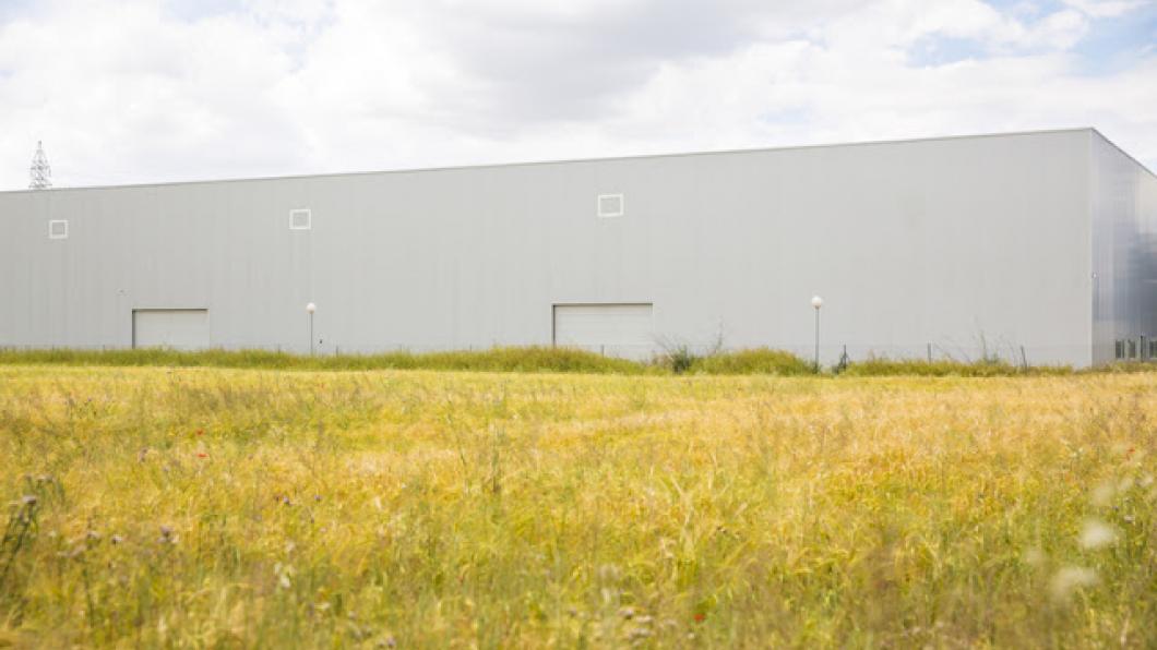
Two of these were located in an industrial area, one of which I visited. The building was a warehouse that was divided into three units with concrete walls. Because of its industrial setting, it was cut off from any of the regular rhythms of a neighbourhood with shops and parks and houses. There wasn’t anywhere you could walk to, unless it was to another warehouse or business.
There wasn’t any natural light inside. There wasn’t anything of beauty, made intentionally for the people who attended the program.
There were hard-working staff making the best of a very difficult situation.
What message did this building communicate to the people who were transported away from residential communities and into that isolated industrial area everyday?What did it say about how these people are valued by the culture at large?
My understanding is that it’s very challenging to get a government-funded spot in one of these programs. The latest trend is for spaces to be offered for a fee to families. The fees seemed to range from $60 to $80 a day, with one program being $100 a day. At one program I visited, I was told that to the daily fee of $55, an additional fee of $200 would be added for an adult who required one-to-one support. Do the math on that annually, and you may be surprised to realize that for a similar amount of money you could easily send another child to university.
Universities are mini-communities, with everything from residences, parks and community centres to libraries and pubs.
Most are situated on lush, rolling campuses draped in vegetation. Buildings are a mix of traditional and modern. The former emulate Gothic stone cathedrals with vaulted ceilings, stained glass windows, marble floors and brass chandeliers. They convey a sense of history, wealth and exclusivity.
In short, they communicate a sense of respect and worth for the students who walk their halls.
Many young adults with a range of disabilities will walk or roll those halls as well, of course.
But for others who won't do post-secondary education or work, it's disturbing to see how quickly we rob them of their value. How quickly we remove them from the mainstream and warehouse them. And ask their families to pay good money for it.